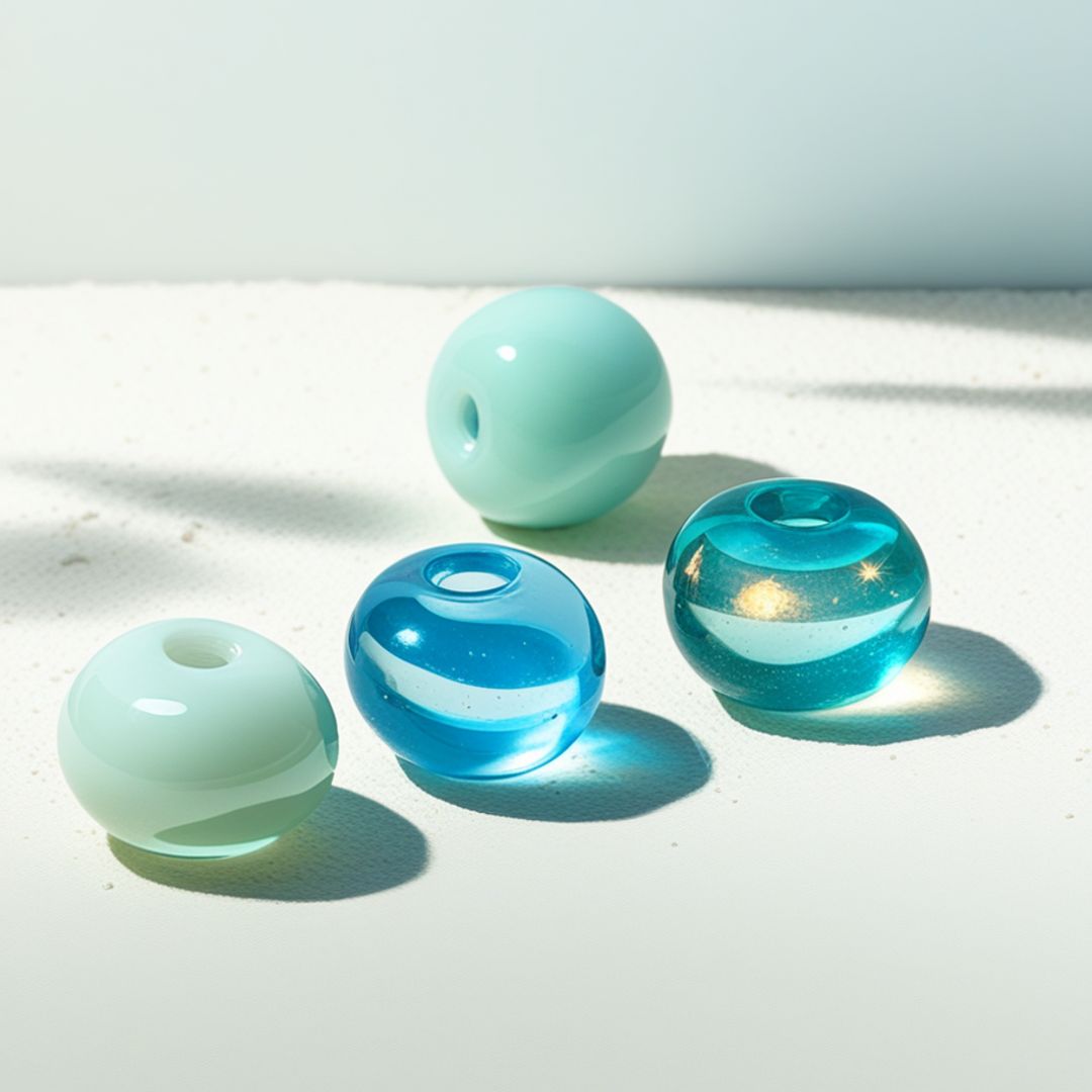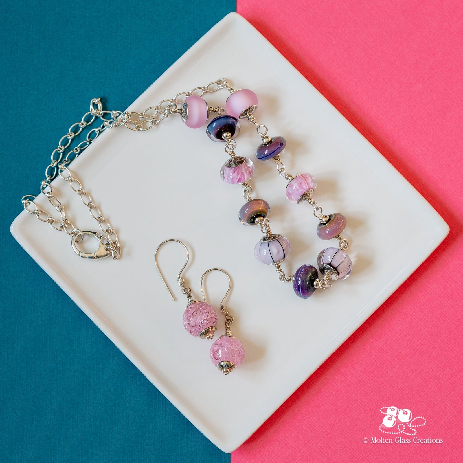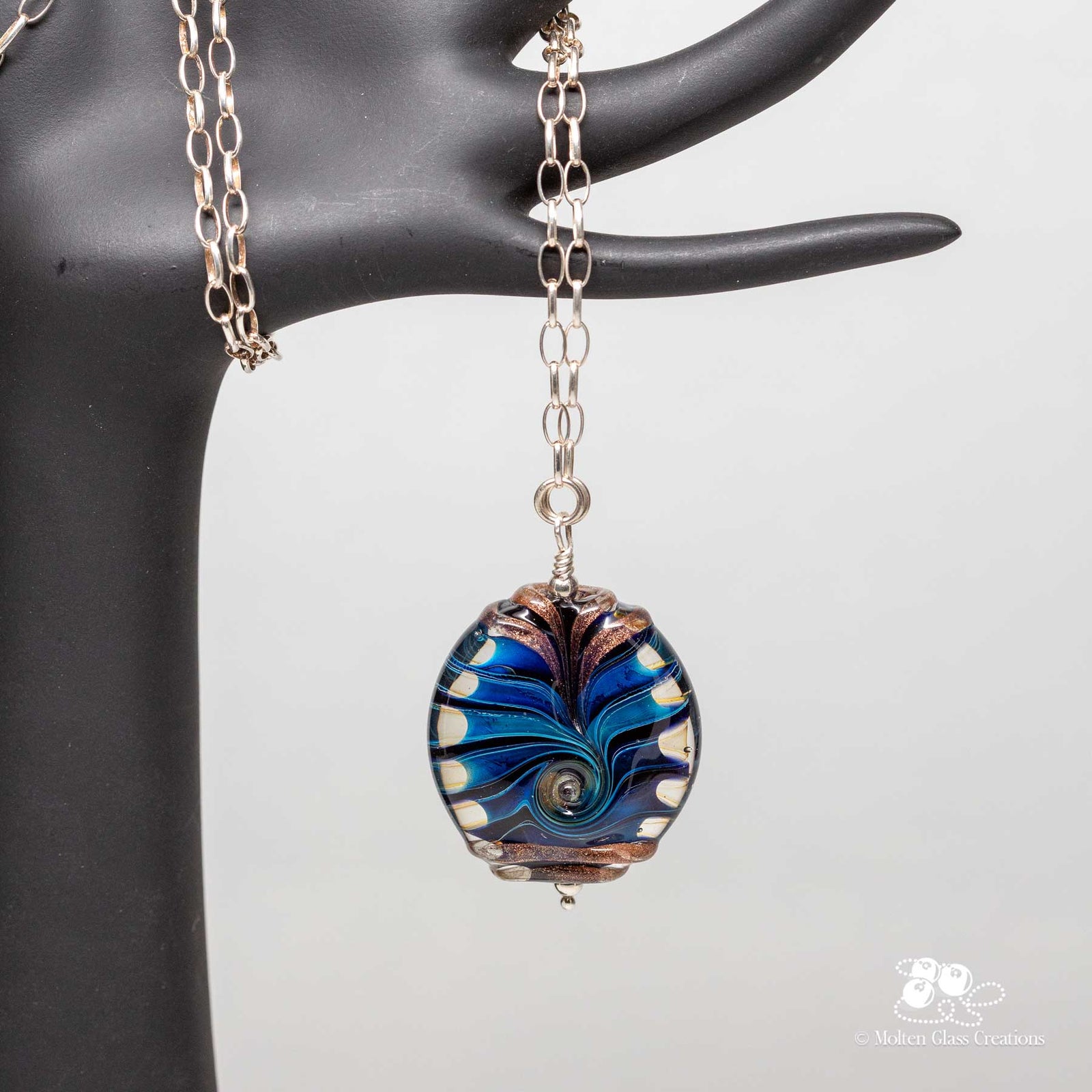

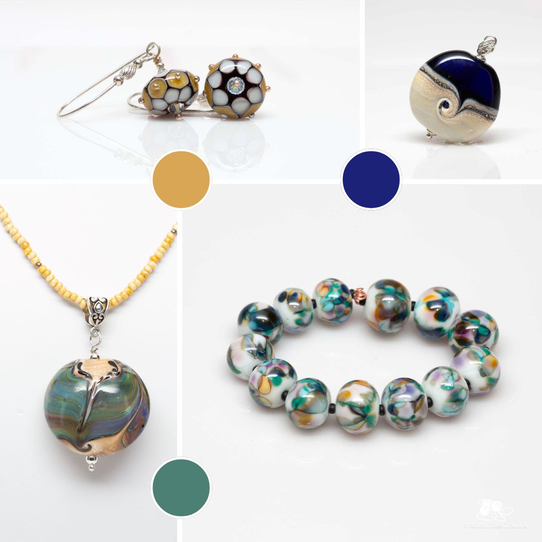

There’s something magical about the shift into fall. The air turns crisp, the light softens into gold, and suddenly the world feels wrapped in richer, deeper colour. After a year of following the seasons in my studio, from the fresh pastels of spring to the bold brights of summer, I’m now leaning into the earthy warmth and jewel tones that define this time of year. My fall mood board is filled with beads in shades of amber, burgundy, forest green, and smoky grey, all softened with hints of ivory and gold. Together, they capture the feeling of cozy sweaters, misty mornings, and long walks under changing leaves.
Reflections on the Year’s Palettes
Each season has carried its own rhythm, and I’ve loved following those shifts in mood and palette. Looking back at these palettes reminds me how colour has shaped each season in the studio.
Spring felt like a breath of fresh air—soft greens, floral pinks, and pastels that seemed to bloom right off the mandrel.

Summer was bold and playful, bursting with bright blues, hot pinks, and sunshine yellows. Those beads practically danced with energy, like long afternoons and laughter-filled evenings.

Fall has a way of slowing me down, and that rhythm naturally finds its way into my work. At the torch, I’m drawn to colours that feel grounding and comforting, transforming molten glass into little reflections of the season’s calm energy.